Author Archive
Q1. In what ways does your media product use, develop or challenge forms and conventions of real media products?
Posted on: April 17, 2013
Q1. In what ways does your media product use, develop or challenge forms and conventions of real media products?
My trailer was designed to appeal to an audience who can sympathise an interest within English drama. DO US PART is an English drama which attracts a large audience in cinemas as it is a typical beginning middle and end story line drama.
After analysing and scrutinizing many trailers I identified a few main conventions that I would need to adapt to my own trailer, firstly : Having an effective voice over allows the actor/s to say little or nothing yet the trailer still flows and a story line is still made clear. The pace of a trailer is slow and steady to being and the pace speeds up either by sequence of shots or music (both) -Tends to last for around a minute-2 .
Generally trailers are released months before the film release to excite viewers and generate talk and word of mouth. they give a small story or some (especially niche/art house trailers) don’t tell a story at all, they may be muddled up and be unclear. but they usually slow and beginning, middle and often leave a cliff hanger.
Much of these conventions are broad and so I narrowed them down to my own genre to make it suitable and appropriate for my audience.
to do this firstly I made sure the soundtrack and music used was appropriate for the voice over and the shots I’ve used -having a clear simple ident as most films with a similar genre used basic idents so attention isn’t focused too much on the beginning, yet still capturing enough to keep an audience tuned in. I made A conscience effort by ensuring each of my shots flowed and didn’t jump from one scene to another too quickly, this was difficult because without having any actors voices and just a voice over this was my guide. Overall I feel my trailer achieved the majority of these conventions: It is still a series of short shots and clips and lasts 2:28.
The trailer allows the audience to experience a brief part of the whole film with an understanding of the story line yet leaves them on a cliffhanger wondering what happens next. As my film is an English drama, you would expect it to have a ‘fairytale’ ending, however as you aren’t given any indication to the ending as most films with the same genre would usually do.
Despite focusing on lots of conventions, I narrowed these down into ‘must haves’ they are that having an soundtrack and music used was appropriate for the voice over and the shots, I began listening to what other songs similar trailers used, I came up with I found you by The Fray Having too many songs in a trailer can distract away from the actual filming and I didn’t want to do this, I did firstly begin by using a coldplay song, I thought it would be a great song and appropriate for the story line but it was too loud and powerful for the clips. The songs are saddening and depressing but create a atmosphere to accompany the film.
Unfortunately one of the conventions I did not conform to was the speed and pace. To start of slow and begin to speed up,I decided to not do this because my actress at the beginning of the film is mourning the loss of her husband she spends the trailer/majority of the film building her life, this does become apparent throughout the film but I didnt want to give it away as I believe the film wouldn’t be as much as a cliff hanger with this. I did speed up the ending where there are 4 title sequences over the top of grass, I felt this was enough suspense.
Using voice overs was the best part of the trailer and the area that I enjoyed most about analysing trailers. They are extremely effective and the use of diagetic sound is a powerful feature. especially with my film as the voice over is the husbands wedding vows, his last line hearing “until death do us part” Watching ‘P.S I love you’ made me want to use the voice over feature of a film.
I thought this would be really effective as its obvious with a male voice. Gerard Butler does the voice overs in this trailer throughout, having a strong male voice captures the audience as my target audience is predominantly young females.
Question 2
Posted on: April 16, 2013
How effective is the combination of your main product and ancillary texts?
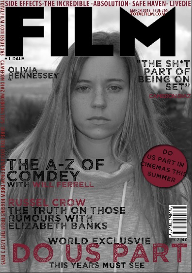
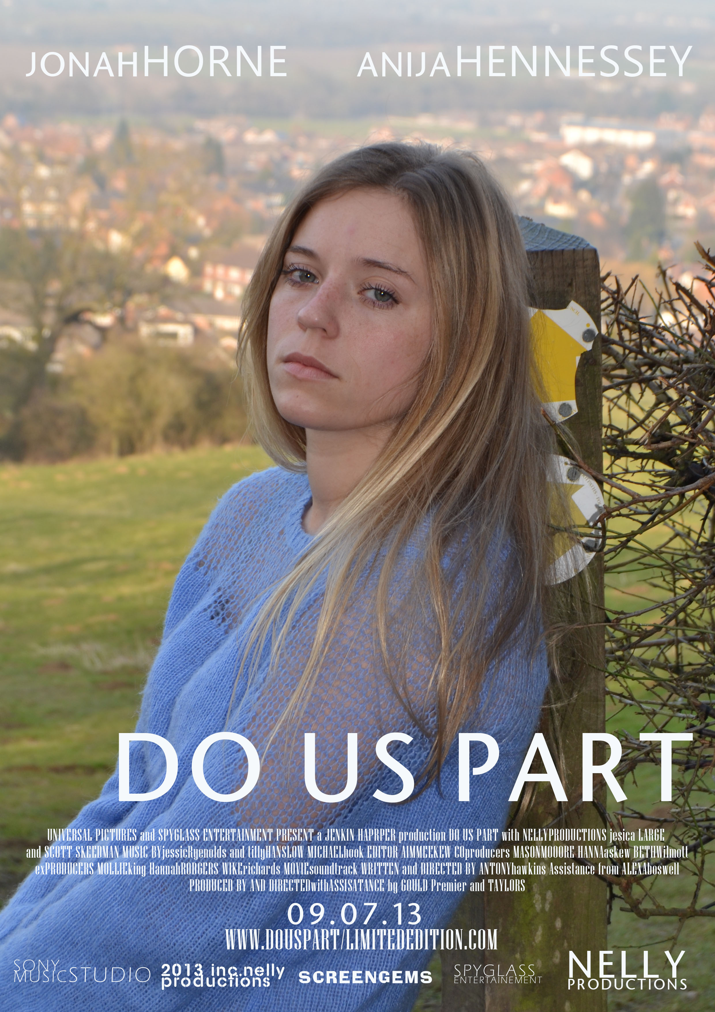
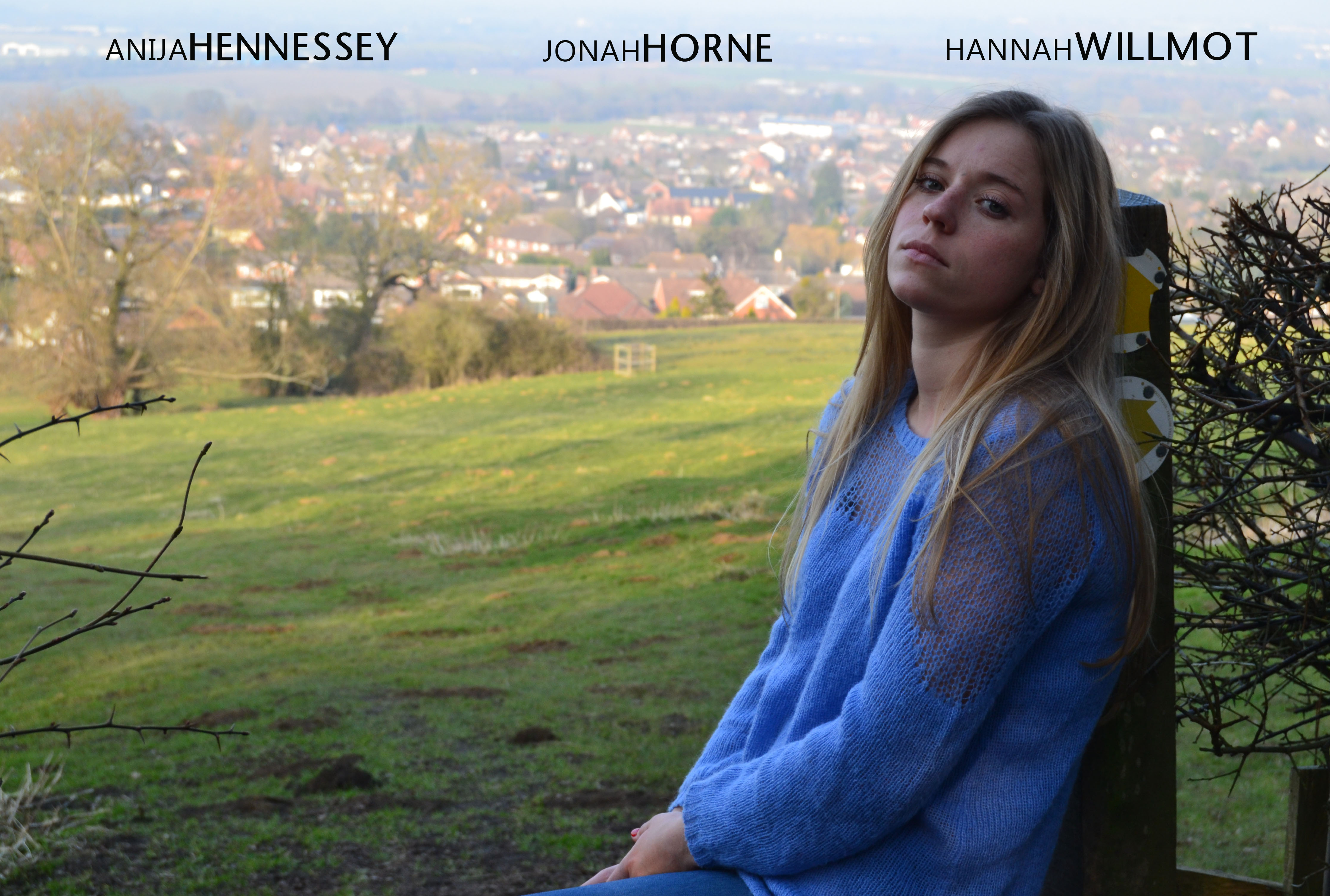
My ancillary texts, film poster and magazine cover link with my trailer through numerous aspects including the text, colour scheme and images. I felt it was really important for each of my media productions to support one another and that they must each support and promote the trailer. I firstly used the same font and text in both my poster and film magazine, along with the text I used in the title sequence in my trailer.


I used the main character in my film as the image on the cover of my magazine and as the face of my film poster this is again very consistent. The connection between my three products were important and from the beginning after understanding and recognizing the conventions I wanted to ensure my audience were able to recognise the actress on my ancillary texts from the clips within my trailer.
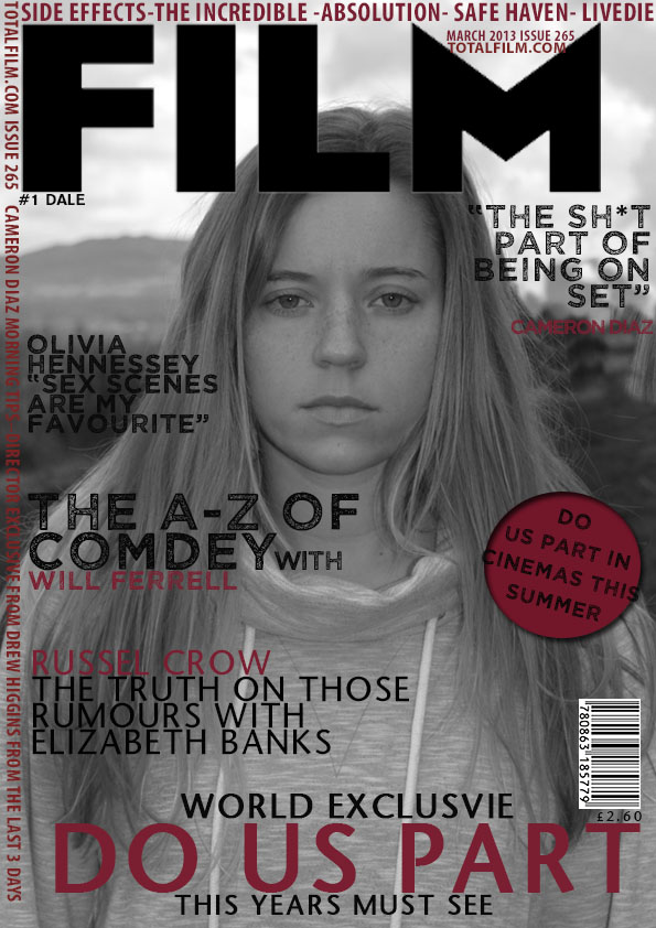
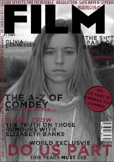
I chose Anija to be the actress in my trailer and to be the face of my poster and magazine, as she is a model she is naturally blessed at showing different emotions attractively! Her face is therefore very recognisable and the audience of young women would aspire to be her and men want to date her! On reflection of my magazine cover I wish I used a coloured image, just because I feel that I have so much colour in the poster and trailer that it doesn’t like as well as the poster and trailer do. However I do still feel that they are recognisable. On the other hand when experimenting and constructing my magazine cover on Photoshop, I found that trying to fade and play around with the saturation of the image did make it look quite right. I really wanted the background of my magazine to be completely different from my poster so that I am not giving too much away in my ancillary texts with the mise en scene and also the setting and location.
I decided to do a photo shoot with my main character in the fields behind my house, I did these on separate days an made sure the weather was similar so that it was consistent.The image I chose for my magazine was appropriate as it was a close up, even thought it looks completely different to the trailer and poster, she still looks upset and mourning the loss of her husband. This makes it look like it has come from a scene from the trailer which is how I hope it would look.
When developing my texts I wanted to make sure that they all looked similar and therefore so that my audience can make a clear connection between my ancillary texts and trailer (main product)I think that my film poster does this better than my magazine cover, I only feel that because of the black and white colour of the magazine cover. I kept each of the texts the same on my poster and magazine cover and trailer as this is the main link between the 3 of my products. The text that I chose is a simple and easy to ready font which stands out and looks appealing to the eye. I stayed away from any fancy fonts which looked too over the top and each of my three products are quick watches or reads! Not only that but I feel it wouldn’t go with the genre and serious story line of my trailer.
If I had the choice I would select my poster to be the first of my three products to be released as I believe this is the most effective piece that can excite audiences and create word of mouth about the new upcoming film. After careful research on where I would advertise my film and the particular locations, I feel it would work best in large areas where my target market would venture through. Therefore on a large scale billboard or promotions areas such as bus stops and tube stations. Following the release of my poster I feel my trailer would work well within promotion on TV channel such a E! ENTERTAINMENT- they show programmes such as chasing the Saturdays keeping up with the kardashians viewers of these programmes are where I feel my target audience would be tuning into. My trailer would also be advertised in the cinema as trailers are shown before another film begins, I wouldn’t chose for my trailer to be shown before a horror movie as that would be the completely wrong target audience for my film to be shown to. A film such as my sisters keeper or wild child as that is where my target audience would be.
The final product to be released would be my magazine. I would advertise this is local news agents and bookshops such a Waterstones and oaks. I would also advertise it in coffee shops such as Costa, Starbucks and Nero, as I understand my target audience enjoy relaxing in these places. To generate a wider audience and possibly persuade people into viewing my film I would then advertise my magazine in large super markets and newsagents, this would generate more awareness amongst a large variety of people.
question 3
Posted on: April 15, 2013
Question 3. What have you learnt from your audience feedback?
I collected audience feedback in a few ways, firstly I took voice recordings, questionnaires, videos and posted my items onto my social networking sites. Gaining audience feedback is important for me a vital part of the development towards my 3 products (im particular the trailer). I therefore invited a few of my friends along to viewing sessions and then asked a few questions afterwards.
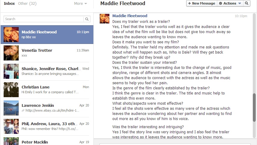
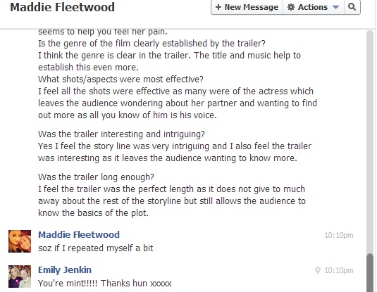
Maddies feedback in very constructive, she is a previous media studies student so she knows about the course so was helpful in giving advice and appropriate comments. She immediately recognised the English drama/romance genre. Maddie particularly enjoyed the music and soundtrack to m y trailer, she thought it was a good way to display the characters emotion without using any speech apart from the voice over. Using social networking sites for feedback was very easy as people are more likely to respond as it take very minimal effort!
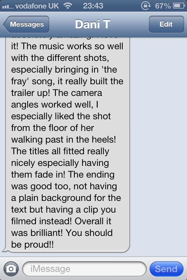
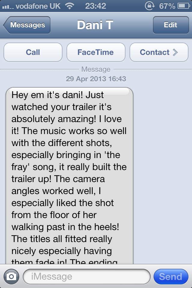
I uploaded this photo of Dani’s feedback twice because it was a longer message I wasn’t able to receive all of it in one go! I learnt from danis feedback that the music used within the trailer and how I placed it between different shots was extremely effective and that she particularly like the shot of my model putting the heels on a walking through the kitchen.
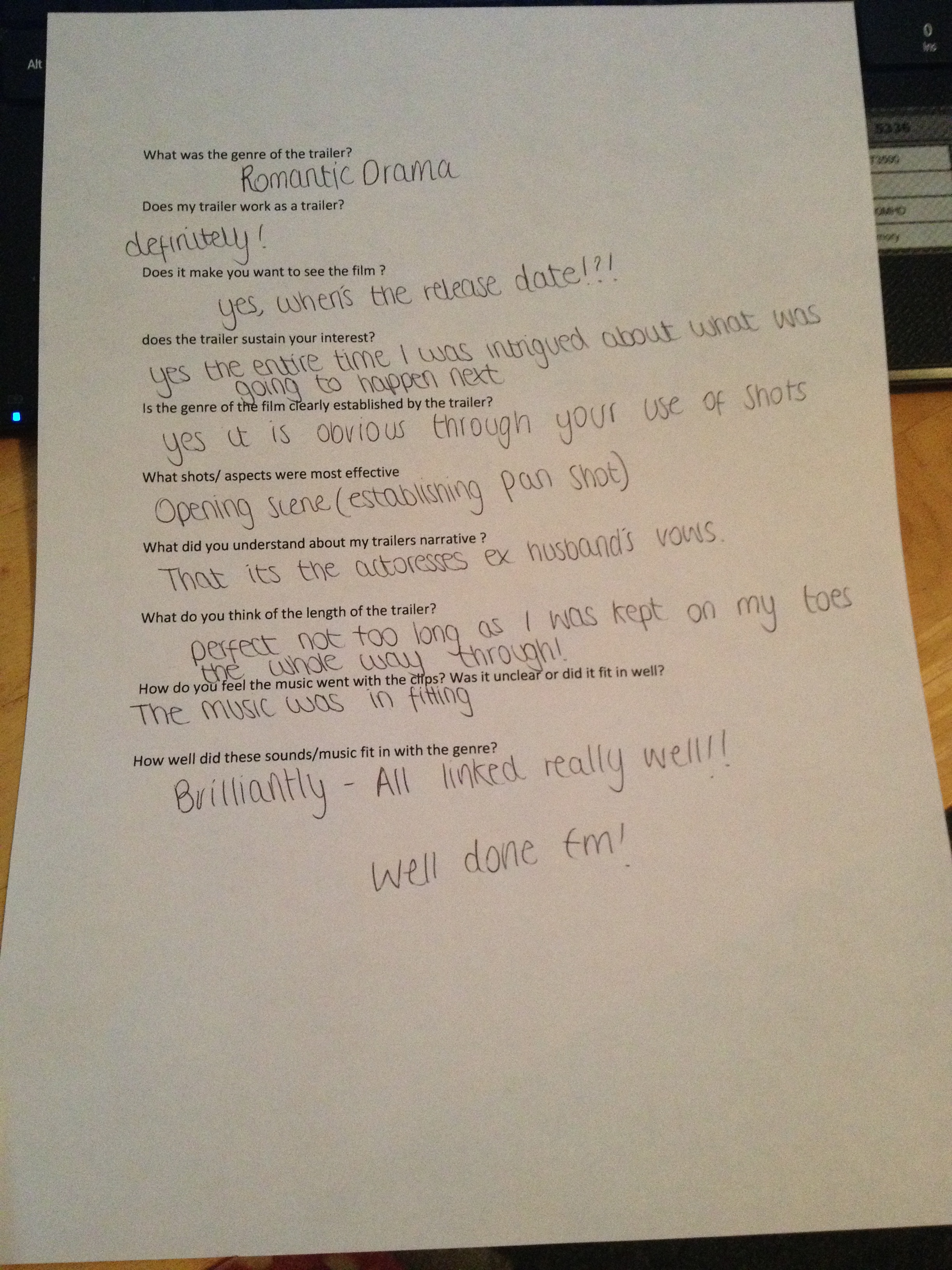
This is one of my questionnaires that I handed out to a group of women ranging from ages 14-36. The feedback I recieved from these were very similar, It taught me that all women that I surveyed were interested in my genre of film. They particularly were drawn to the voice over and felt that it was a lovely touch to the trasiler without showing the male(husband)
Question 4
Posted on: April 15, 2013
How did you use media technologies in the research, planning and evaluation stages?
Creating a trailer is a long, complex process with a lot of trail and error experimenting which can be time-consuming so therefore I made sure I used my time wisely! When I was planning, making and evaluating my products I tried to use as many different media technologies as possible, this was so that I could demonstrate and challenge myself with new programmes and also show off what I already knew. Firstly I used my blog to record everything like a diary, Everything that I have completed practically is posted into my blog (ejenkinchs) and there are also some theory lessons which I have posted into this. I have found it helpful to jot down helpful links and thoughts and quick ideas which I have had along the way.
For year 13 I organised my blog so that there were 4 categories, these were:
- Research & Planning
- Construction
- Final Product
- Evaluation
This therefore meant that I completed the steps in order from the idea to completion! I also kept note of my progress in my diary and making constant reminders to myself of what I needed to do on particular weeks, as falling behind is something I’m very good at! (you’re all nodding now) Using categories allows my blog to hold a good structure and allows anyone to find their way around the posts. By using YouTube I was able to upload parts of my trailer that I had completed (so far) for example my ident, as I created this separately to my trailer. By posting in my blog is was a written evidence of work completed so that my teachers, tutors and peers could see how far I was in front ( or more often than that… behind)
While in my research and planning stage it was important for me to use the internet ALOT! I therefore became very familiar with Google, this is a simple search engine which can find pretty much anything you desire. It was particularly successful while searching for recent films and information about these films.
While using YouTube was great for searching for trailer that I knew about, it has a section on the website named ‘other suggestions’ this area became really helpful as my knowledge in film genre was very limited before the course began, however this area showed other trailers with similar storylines/genres. This gave me far much to look into and I feel helped me very much. I also found the website IMDB through using Google. It has information about all types of film and tv knowledge! I gathered a lot of research into existing trailers and their conventions before beginning my own so I had a basic understanding of what I needed to make my trailer to the best of my ability.
During my planning I was also able to access to previous students work and their own research, this was really helpful as it was a framework and a guide of what is expected. despite not using it on my blog I did use the social networking site Facebook and Twitter to communicate with my fellow classmates to discuss where we were and quiz them on niggling questions about my product. Being able to see one another’s blog was really helpful as we were able to give one another constructive criticism.
On my blog I received important feedback from Mr. Gould and various other teachers who were able to push me in the right direction and nudge me into doing my work! I took These comments on board and acted upon them to try to better my work. Classmates were also able to comment on one another blogs and therefore give opinion of work done so far.
In the first few weeks of the course I was given the opportunity to venture around the school site and practice with a camera. After learning last year about all of the different camera angles, I thought I’d pick it up really quickly but turns out I was like bambi on ice with a camera! This was a really important exercise to do as it gave me some experience instead of diving in at the deep end and gave me something to improve on for next time. The next time I used the camera I made sure I went out with a tripod so it kept my establishing shots and pan shots smooth. I shot all of my footage on a Nikon
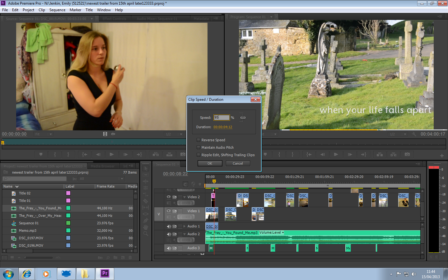
The main part of the course I found the hardest was getting to grips with Adobe Premier Pro, this was the programme that I used to edit and put my trailer together. I found it quite tricky to use as I have never used it before. I used various tutorials on YouTube and from Google to help me and I soon picked it up. From using the school cameras previously I therefore had some basic (dodgy) footage of students walking around the site, but I was able to edit something. I also bought a book called ‘Premier Pro for DUMMIES’ much of this book was very complex but it had everything I needed if I were to get stuck. It became very useful and had a lot of key advice to make the most of the programme.
For my magazine cover and poster I used Adobe Photoshop CS5, as I was familiar with this programme from using it last year I was quite happy to try to be a little brave and try out other tools which I had not yet taken advantage of, again using YouTube tutorials and taking the time to learn tools such as burn and magic wand. As I was comfortable with these programmes and felt confident with them it took much less time than expected to complete my magazine cover and poster.
Onto my evaluation, generating audience feedback I used my own camera rather than the schools. Which is a basic Samsung 12.2 MP video recorder, I chose to use my own as I wanted to experiment with another media technology.From this I filmed my friend Hannah and I having a conversation about my trailer. I also used my social networking sites Facebook, Twitter and YouTube account to ask my friends to view the trailer and give me any feedback (good or bad) I also used my mobile phone and used an app called FaceTime to speak to my cousin who lives in Australia. This app is a free video messaging service similar to Skype. The feedback I received was helpful not just with my evaluation but self satisfying knowing that I had correctly targeted my audience.
drawing to the end of my evaluation I tried to use as many different types of technology as I could ranging from Microsoft power point that I converted onto slide share and scribd.com to embed into my blog, I also recorded myself on a microphone accessory, then converted this onto soundcloud and created an audio clip.
Throughout the entire course I have varied my use of technologies so I have been able to gain an in depth understanding in many areas of media programmes, and therefore media knowledge.

poster/billboard
Posted on: March 20, 2013
I love this image but I dont think its in fitting with what a usual poster would look like. I now need to crop it so she is more central
Film Poster (Research)
Posted on: March 20, 2013
Part of the course requires me to produce a film poster. Posters are an important part of the film’s print marketing strategies. Posters are often displayed at bus stops, tube stations, magazines, cinemas. I feel they can be more they effective than advertising in a magazine as they reach out to a wider variety of audience .
As my film is Romantic comedy I am going to look at recent and older films that have been released at a similar story line and genre to explore their conventions and differences from a magazine cover. It is very important though that I keep in mind that my trailer, magazine cover and poster do look like they’re from the same film.
 I Give It A Year is a recent release, this was a poster I noticed on a bus stop. The film is about how a couple are lasting a year on from getting married. Staring Simon Baker from The Mentalist. The poster is simple however it gives a simple message. As the three couples sat on the sofa are giving away three different poses, one being happily in a relationship, the other content and the last fed up! The main photograph is in the center of the image, with two critics comments above and below, framing the image.
This is a successful poster and I feel puts the message of what the story line of the film is about but therefore doesn’t give anything away either.
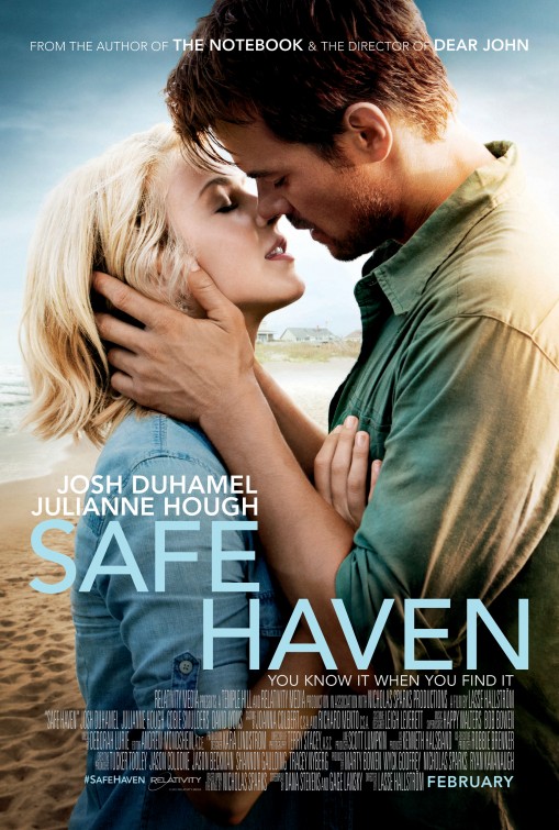
Safe Haven is another new release which came out on valentine’s day this winter. Staring Julianna Hough. This cover features a large image of a couple of sharing a kiss. The background is a beach setting with sand and the sky, interestingly titles have been placed in the sky too, this may be so areas of the poster didn’t look too empty compared to the rest of the image. This gives the audience the impression that it is a romance/ chick flick film.
The actors hands are a prominent part to this poster as the rest of the image and their clothing is very dark when it contrasts with his hands. and her glowing face, indicating the ‘SAFE HAVEN’. The credits have been arranged in a conventional way by placing them towards the bottom of the poster as most film posters tend to do.
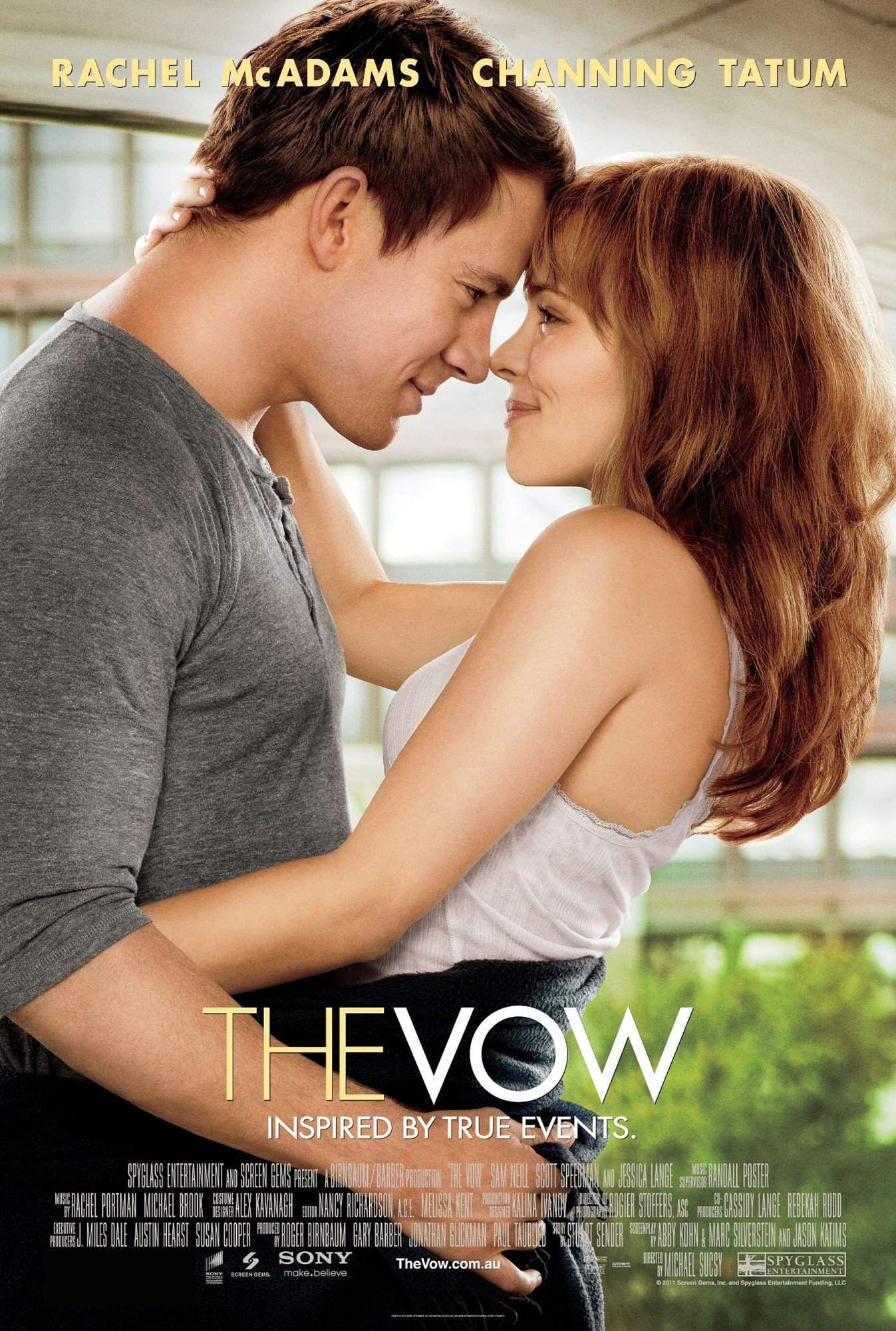
The Vow staring Rachel McAdams and Channing Tatum is a romantic drama released in february 2012
A car accident puts Paige in a coma, and when she wakes up with severe memory loss, her husband Leo works to win her heart again. This poster is alot like Safe Haven as the couple are embracing one another. This has helped me understand that I would like my model to be centered in my image rather than slightly to the left/right. The titles on each poster vary, this poster has it mid/lower with the actors names towards the top of the page. This is what I would like to acheive with my poster.
trouble with viewing text
Posted on: March 20, 2013
on my magazine cover one of my stories on the side is difficult to read because of the trees in the background so I’m going to use the clone stamp tool to remove the tree. To use the tool you can select an area which needs to be removed and replaceit with a colour from another part of the image. It works well with a blurred background better than the focus of an image.