Archive for March 2013

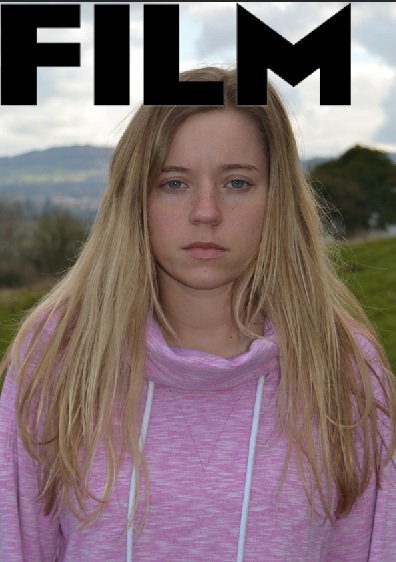
poster/billboard
Posted on: March 20, 2013
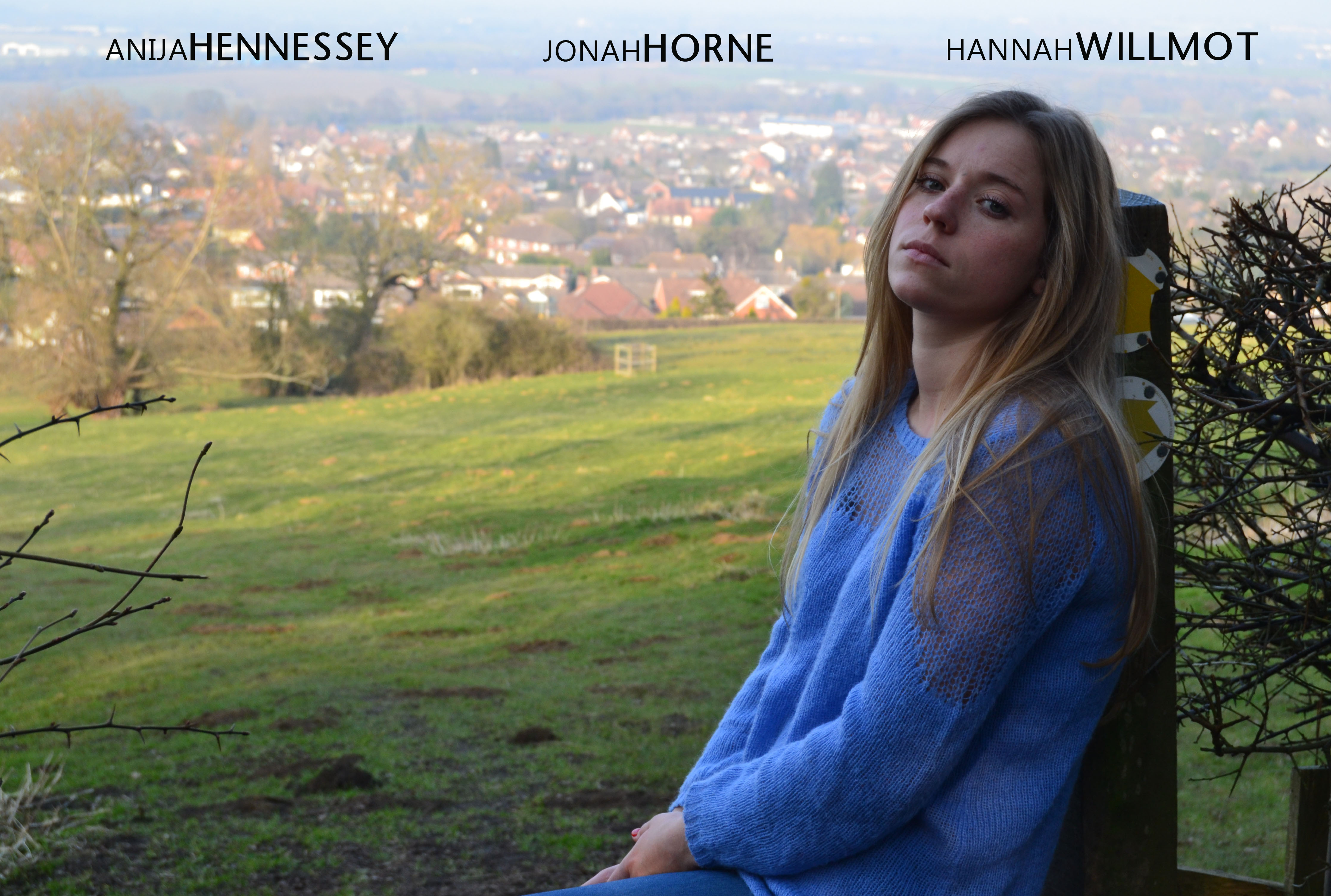
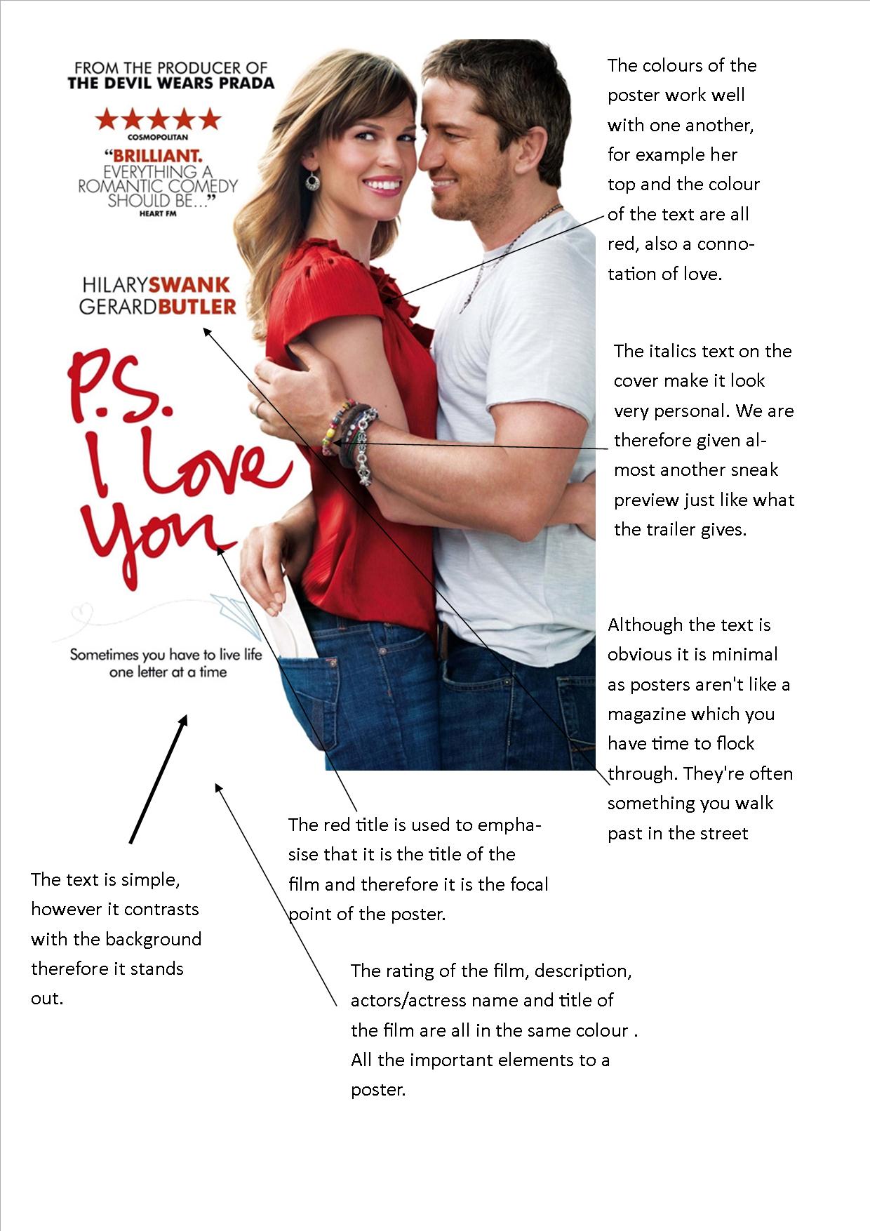
I love this image but I dont think its in fitting with what a usual poster would look like. I now need to crop it so she is more central
Film Poster (Research)
Posted on: March 20, 2013
Part of the course requires me to produce a film poster. Posters are an important part of the film’s print marketing strategies. Posters are often displayed at bus stops, tube stations, magazines, cinemas. I feel they can be more they effective than advertising in a magazine as they reach out to a wider variety of audience .
As my film is Romantic comedy I am going to look at recent and older films that have been released at a similar story line and genre to explore their conventions and differences from a magazine cover. It is very important though that I keep in mind that my trailer, magazine cover and poster do look like they’re from the same film.
 I Give It A Year is a recent release, this was a poster I noticed on a bus stop. The film is about how a couple are lasting a year on from getting married. Staring Simon Baker from The Mentalist. The poster is simple however it gives a simple message. As the three couples sat on the sofa are giving away three different poses, one being happily in a relationship, the other content and the last fed up! The main photograph is in the center of the image, with two critics comments above and below, framing the image.
This is a successful poster and I feel puts the message of what the story line of the film is about but therefore doesn’t give anything away either.
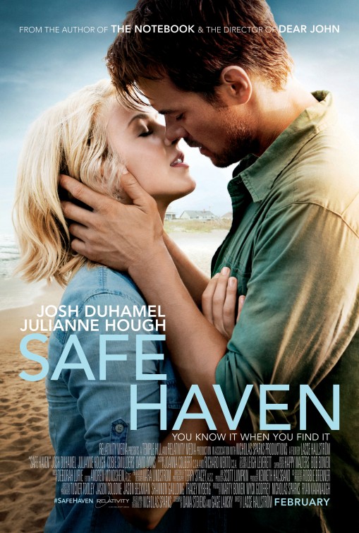
Safe Haven is another new release which came out on valentine’s day this winter. Staring Julianna Hough. This cover features a large image of a couple of sharing a kiss. The background is a beach setting with sand and the sky, interestingly titles have been placed in the sky too, this may be so areas of the poster didn’t look too empty compared to the rest of the image. This gives the audience the impression that it is a romance/ chick flick film.
The actors hands are a prominent part to this poster as the rest of the image and their clothing is very dark when it contrasts with his hands. and her glowing face, indicating the ‘SAFE HAVEN’. The credits have been arranged in a conventional way by placing them towards the bottom of the poster as most film posters tend to do.
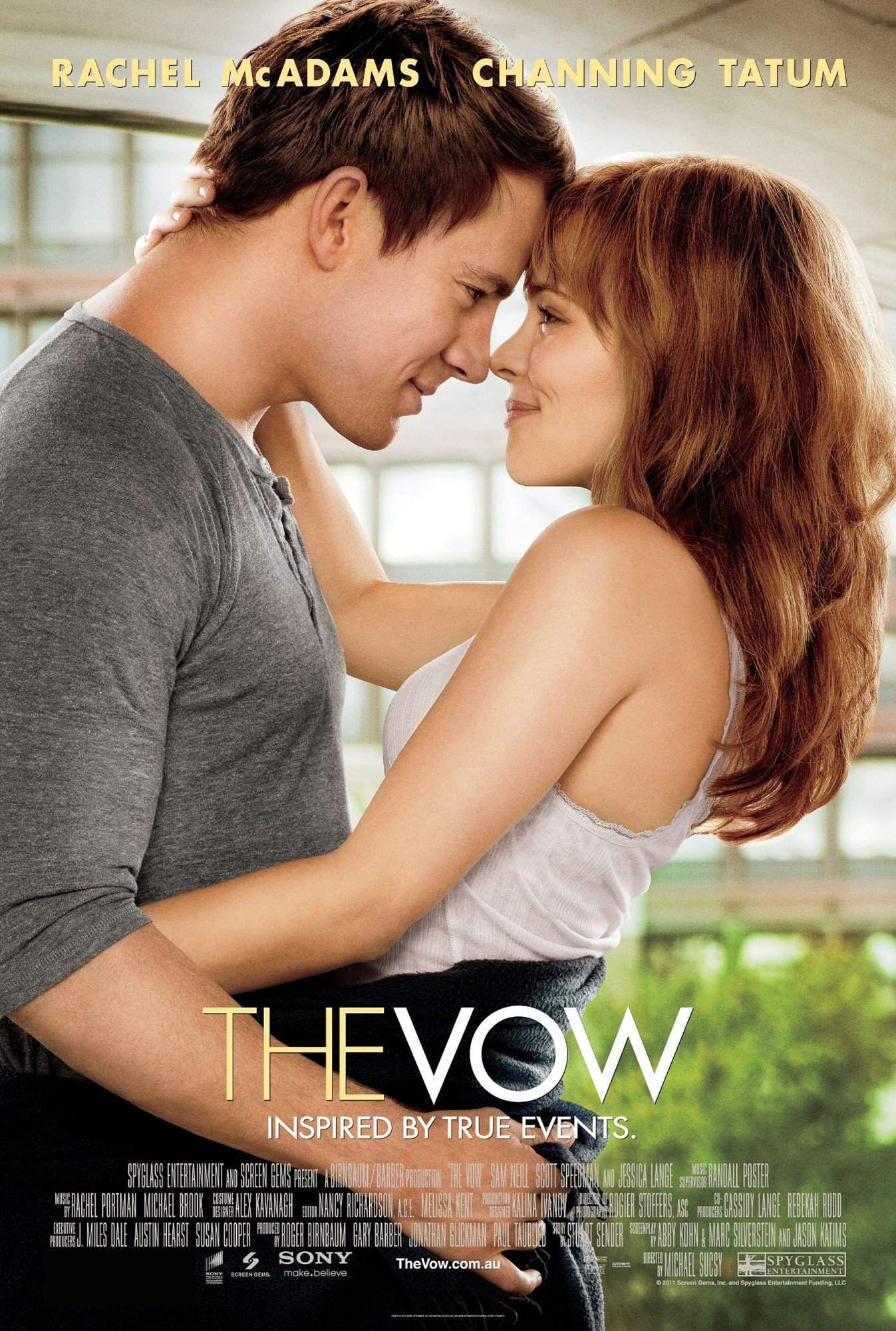
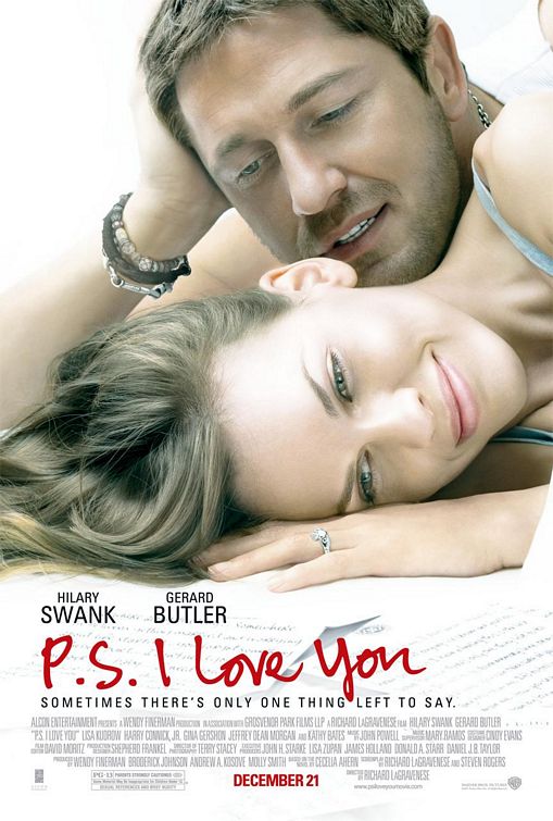
The Vow staring Rachel McAdams and Channing Tatum is a romantic drama released in february 2012
A car accident puts Paige in a coma, and when she wakes up with severe memory loss, her husband Leo works to win her heart again. This poster is alot like Safe Haven as the couple are embracing one another. This has helped me understand that I would like my model to be centered in my image rather than slightly to the left/right. The titles on each poster vary, this poster has it mid/lower with the actors names towards the top of the page. This is what I would like to acheive with my poster.
trouble with viewing text
Posted on: March 20, 2013
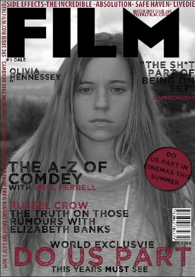
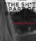
on my magazine cover one of my stories on the side is difficult to read because of the trees in the background so I’m going to use the clone stamp tool to remove the tree. To use the tool you can select an area which needs to be removed and replaceit with a colour from another part of the image. It works well with a blurred background better than the focus of an image.
fixed
Posted on: March 20, 2013
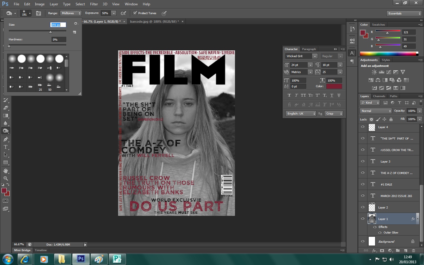
I have organised the colour and fixed the text and changed soe of the font. I now feel that my image of my model is a little pale, so I am going to use the burn tool to give her some colour on he face. experiementing with this will allow me to decide what will look best.
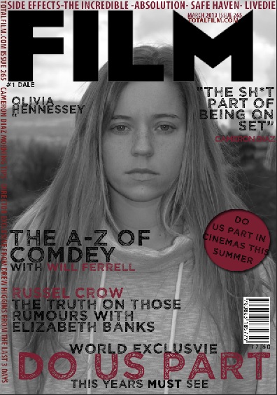
progression of my magazine cover
Posted on: March 20, 2013
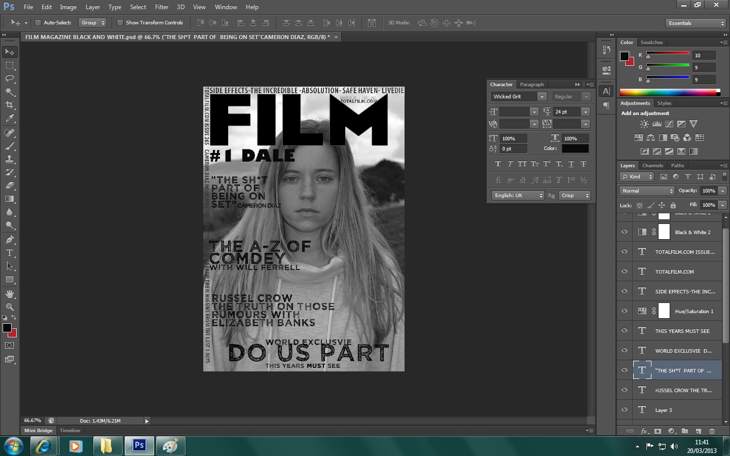
so far so good. I am making progress on the magazine cover by using the one above as a template! As I am using the new photoshop on a different computer I am struggling to change the colour of the text. I will upload another photo once I have worked out how to change it. The colour with be red.
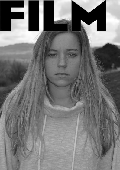
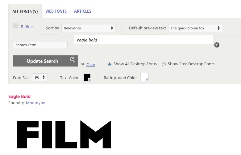
FILM font
Posted on: March 20, 2013
http://www.fonts.com/search/all-fonts?searchtext=eagle+bold#product_top
using this website I was able to find the font that FILM use. I tried to use my own font but looking at film magazines I understood that this is a well recognised and known magazine to the readers.
dilemma with the mag
Posted on: March 19, 2013

after all of my changes I have decided I want to go back to my original images as I’m finding it really difficult to find colors which blend in well but still stand out from the grey background. I am now going to undo all of my changes. Its good development though as now I know I want to keep both magazine and poster really similar and consistent.
