Archive for October 2011
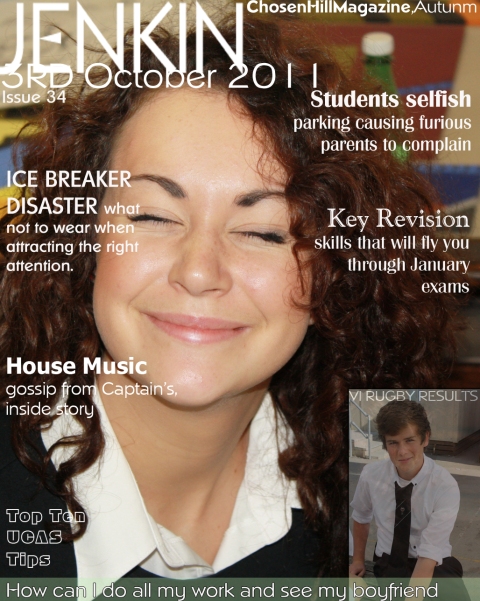
Final magazine cover
Posted on: October 19, 2011
cover line fixed :)
Posted on: October 19, 2011
twing twong twang
Posted on: October 19, 2011
Final adjustments
Posted on: October 18, 2011
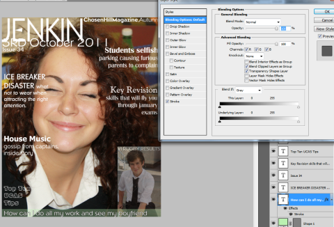
I struggled to find a way around the altering text at the botton so it would stand out, although I did want to keep with the continuation of white text which I took from the vogue magazine. also the edges of my cover look slightly messy . I have now taken the view tool and selected grid to aline each of my coverlines to neaten it up.
Almost there…. SHAAATING
Posted on: October 12, 2011
 I have now completed all my coverlines and edited them to different fonts, but I have also been careful not to overload my magazine cover with too many fonts and bold outlines, as from my research I have found that this cramps their cover and doesnt draw your eye to anything, it makes it look cheap and unattractive. However by choosing the white font to be consistant Im struggling to fit one of my stories onto the cover as it clashes with her white collar.
Barcode dilema
Posted on: October 12, 2011
Progression
Posted on: October 5, 2011
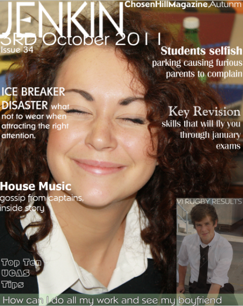
 Here I have inserted a simple masthead with the obvious name of JENKIN. Underneath this I have deliberately overlapped the date within the masthead name, I love how this blends and contrasts with the model’s hair, Lucky she was brunette!
Next I would like to add more coverlines and text to intise a reader, I’d also like to try to include a few more images, possibly just one. This would allow the audience to see what’s inside and to include a small story.
Magazine adjustments
Posted on: October 5, 2011
 here is the Image I chose of a student, enthusiastically expressing her emotion to her school work and social life that is combined with sixth form. This image was larger but I chose to crop it down to a smaller scale focusing on the subject instead of a larger area of background.
I’ve also brightened her facial area to enhance her expressions, as this is my first time using Photoshop I’m just experimenting with many different tools and playing about with them, this will be beneficial when it comes to evaluating as by then I will have learnt much more and be able to criticise my work constructively.
first shoot… duh duh duuuuuuh
Posted on: October 4, 2011
contact sheet media here is a link to my contact sheet which directs you to my photos.


